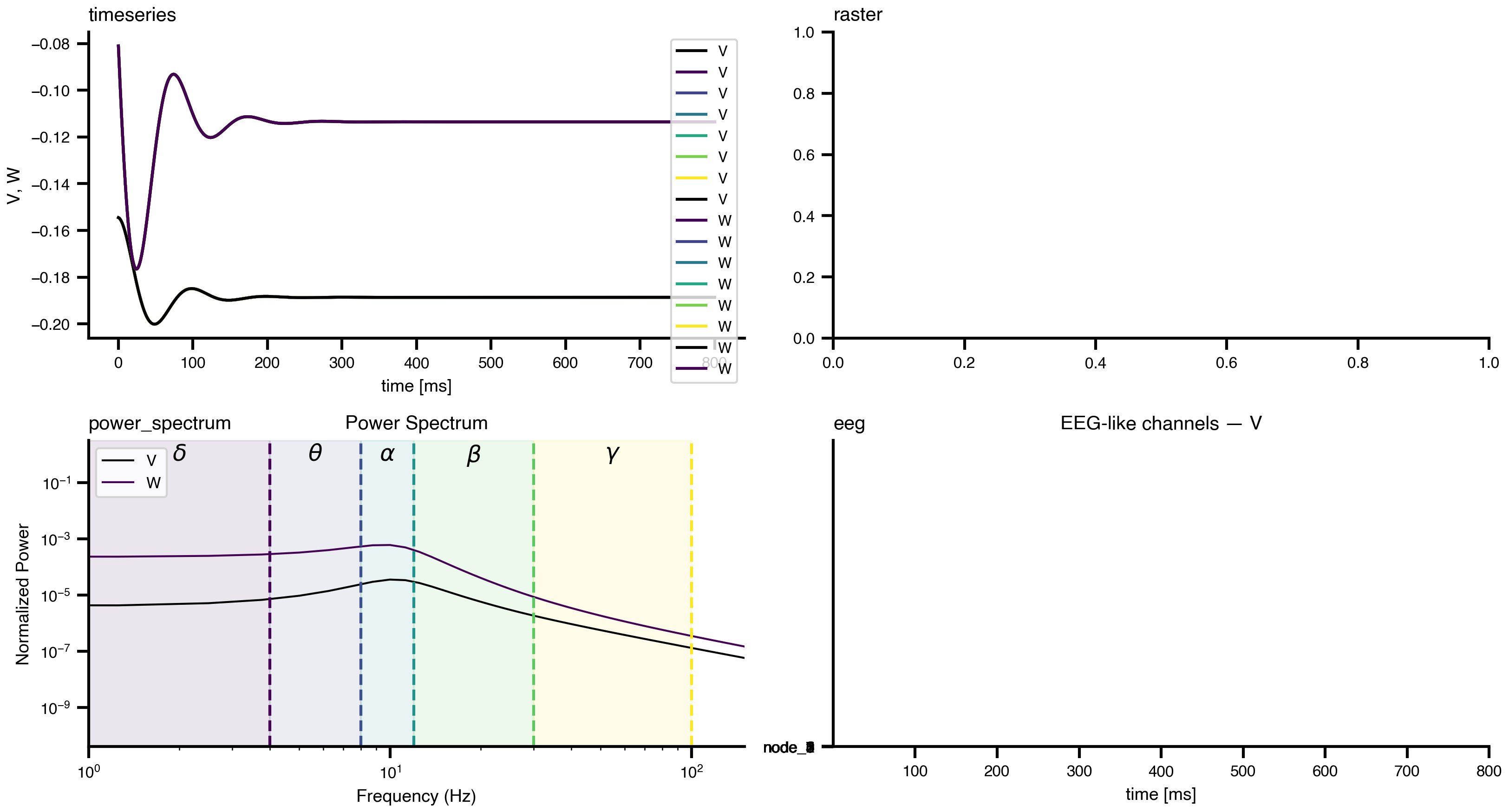
Plot results the built-in way: time series, rasters, connectivity matrices, and network graphs.
Most objects in TVBO know how to draw themselves. A result can plot its own time series, a network its connectivity, a model its trajectories, so the common views need no plotting code at all. Everything below returns ordinary Matplotlib objects, so any figure can be captured and restyled.
Figure 1: The same simulation in four built-in views.
Passing ax= places a plot into an existing axis, which is how the panel above is built. Without it, each call makes its own figure.
Plotting a network
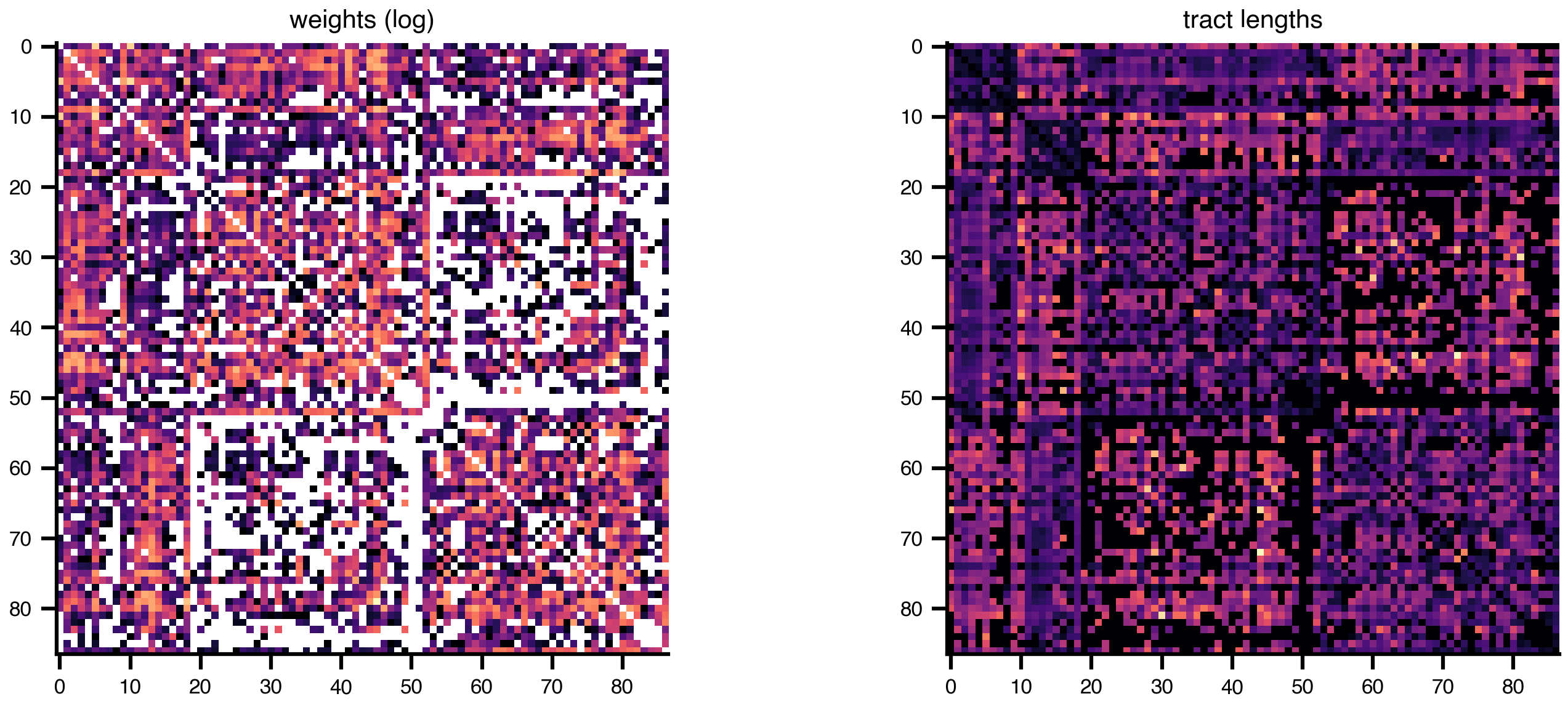
A connectome has several standard views. plot_matrix() is the quickest look; the per-property helpers take an explicit axis so they can be composed.
Code
net = Network.from_db(atlas="DesikanKilliany", rec="dTOR")fig, axes = plt.subplots(1, 2, figsize=(10, 4))net.plot_weights(axes[0], log=True) # note: these take `ax` positionallynet.plot_lengths(axes[1])axes[0].set_title("weights (log)", fontsize=10)axes[1].set_title("tract lengths", fontsize=10)plt.tight_layout()plt.show()
Figure 2: Structural connectivity of the Desikan-Killiany connectome: streamline counts (log-scaled) and tract lengths.
plot_overview() assembles a multi-panel summary with one row per edge property, each pairing a brain surface with its matrix, and plot_brain_surface() renders the surface alone. Both are heavier calls that build their own figure:
net.plot_overview(log_weights=True) # brain surface + matrices, one row per propertynet.plot_brain_surface() # surface only
Plotting a model
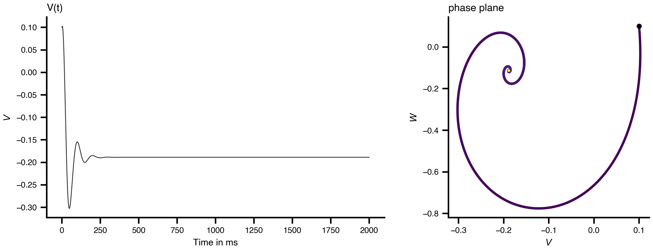
A Dynamics can draw its own trajectories. Passing state-variable names selects the projection: one name gives a time course, two give a phase portrait:
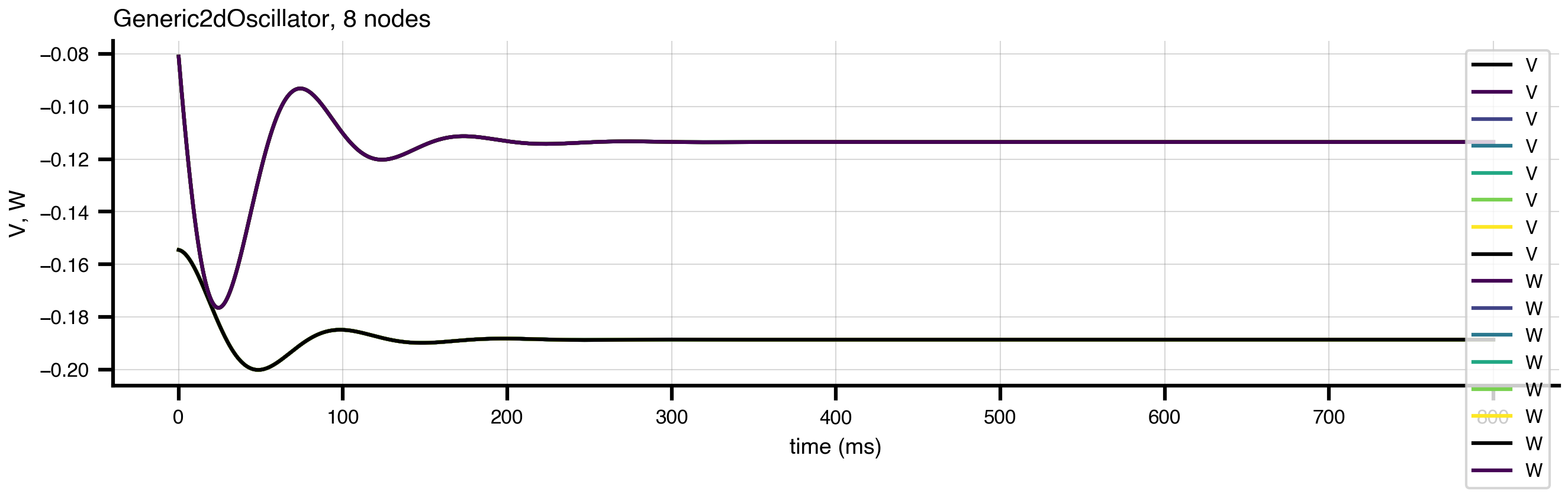
Figure 4: A built-in plot, restyled after the fact.
bsplot.style.use("tvbo") (applied at the top of this page) sets the house style for every subsequent figure.
The network as a graph
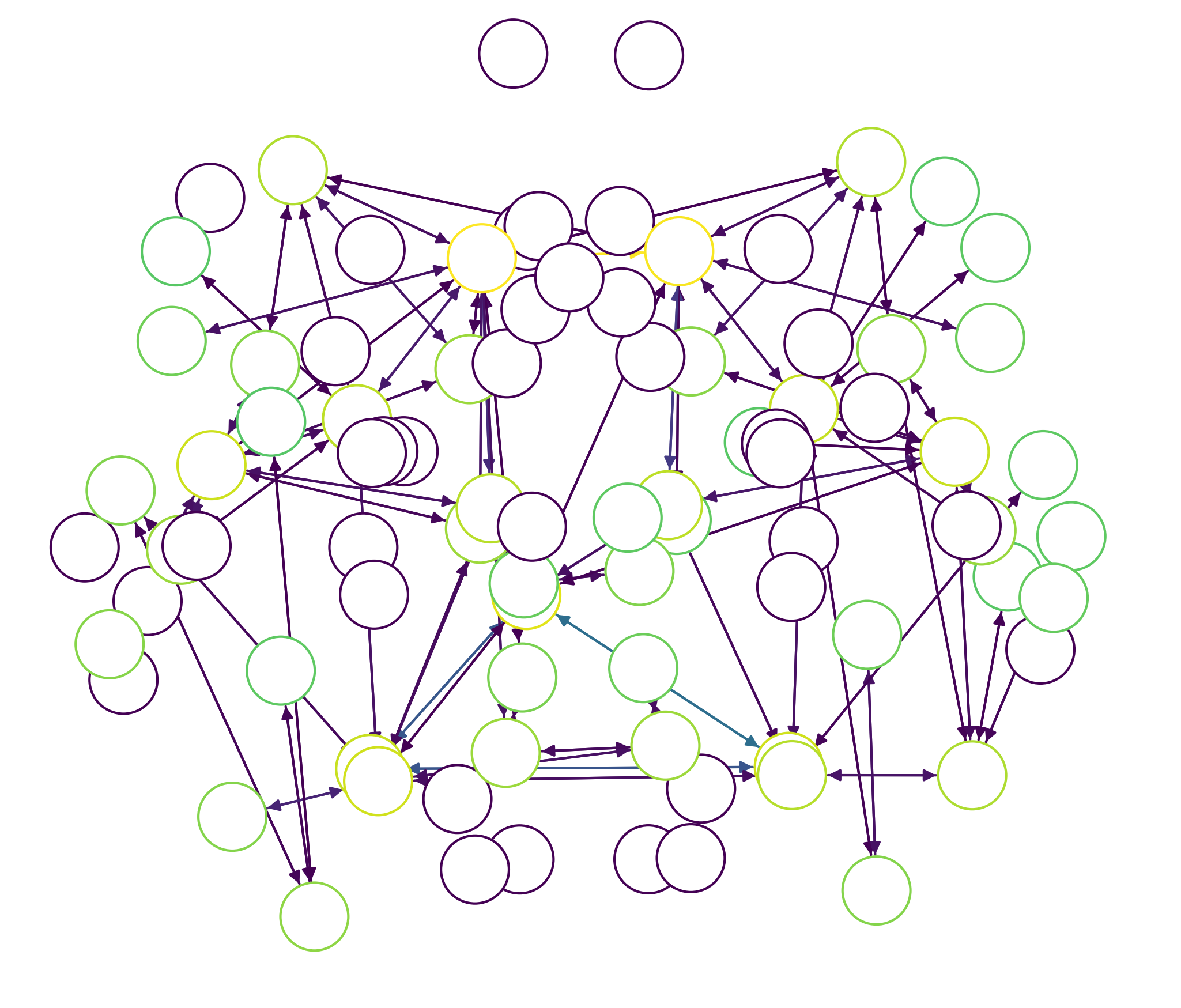
plot_graph() draws the connectome as a node-link diagram rather than a matrix, which makes hub structure legible. Thresholding keeps the strongest edges:
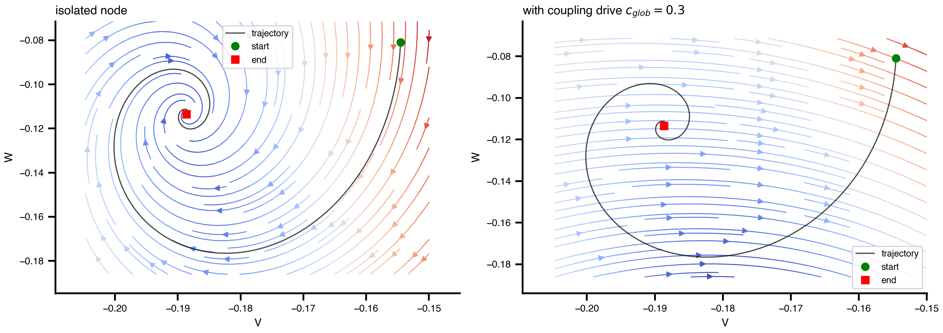
Figure 6: Vector field of the Generic2dOscillator with the simulated trajectory overlaid. Coupling inputs are evaluated at zero — the isolated-node flow.
A phase plane needs values for anything the model’s equations expect but the plane does not supply, namely the coupling inputs. By default these are evaluated at \(0\), giving the isolated-node field; pass inputs={"c_glob": ...} to draw the flow at a fixed coupling drive, as on the right above.
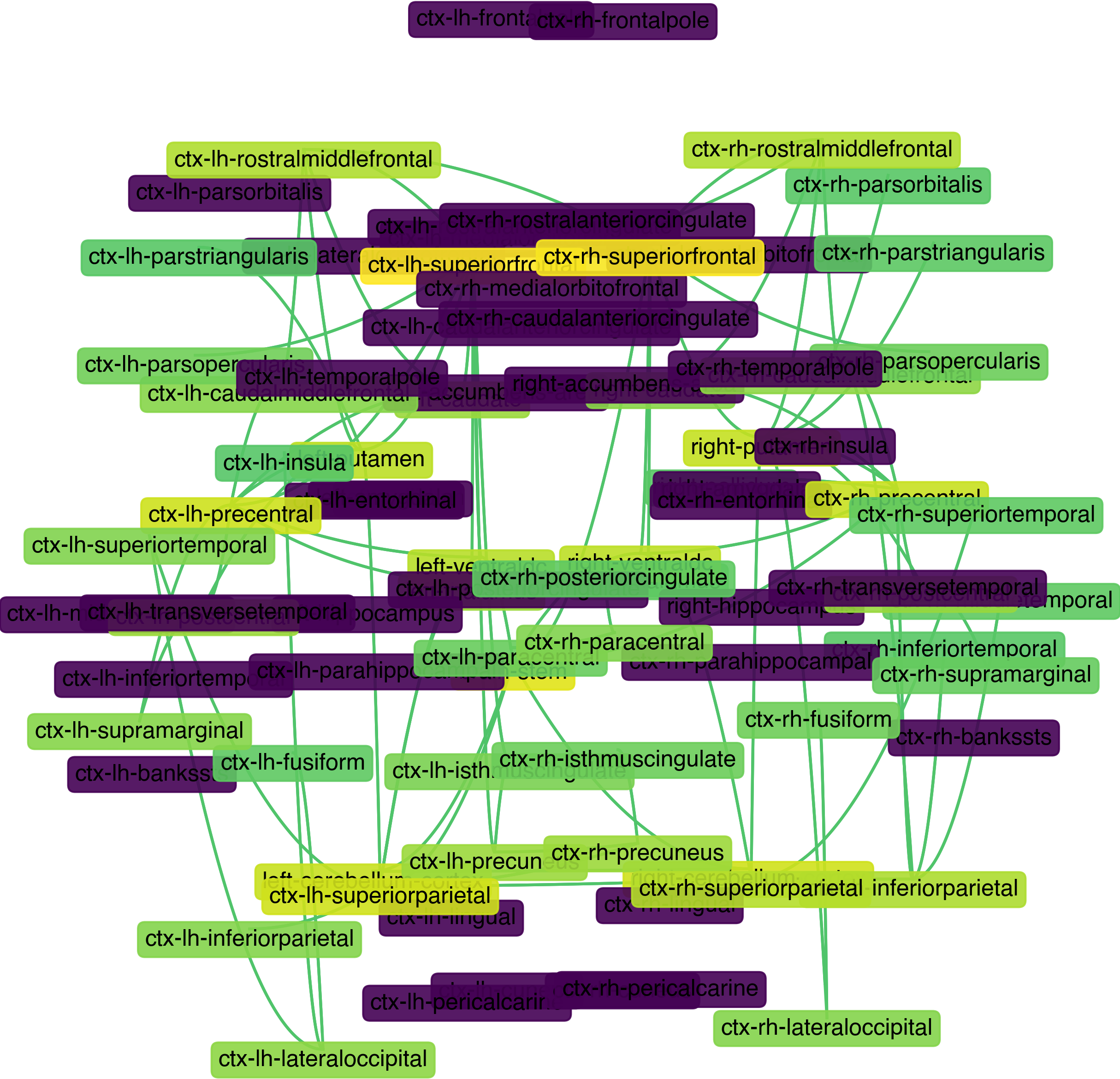
plot_graph has two rendering backends. The default networkx one is shown above; format="bsplot" draws the same graph through bsplot’s edge renderer, which gives curved edges and the house styling:
Code
# The bsplot backend builds its own Figure outside pyplot's registry, so return it# rather than calling plt.show() — which would have nothing to display.net.plot_graph(format="bsplot", threshold_percentile=98, node_labels=False, edge_labels=False,)
Figure 7: The same thresholded connectome through the bsplot backend.
Requires bsplot ≥ 0.0.8
Older bsplot releases raise NameError: name 'colormaps' is not defined from bsplot/graph/edges.py, which lacked the matplotlib colormap-registry import. If you hit that, upgrade bsplot; the default networkx backend is unaffected either way.