import os
cpu = True
if cpu:
    N = 8
    os.environ["XLA_FLAGS"] = f"--xla_force_host_platform_device_count={N}"

import copy
import numpy as np
import matplotlib.pyplot as plt
import jax
import jax.numpy as jnp
import optax

jax.config.update("jax_enable_x64", True)

from tvboptim.types import Parameter, Space, GridAxis, UniformAxis, DataAxis
from tvboptim.utils import set_cache_path, cache
from tvboptim.execution import ParallelExecution
from tvboptim.optim.optax import OptaxOptimizer
from tvboptim.optim.callbacks import MultiCallback, DefaultPrintCallback, SavingCallback

from tvboptim.experimental.network_dynamics import Network, prepare
from tvboptim.experimental.network_dynamics.dynamics.tvb import ReducedWongWang
from tvboptim.experimental.network_dynamics.coupling import FastLinearCoupling
from tvboptim.experimental.network_dynamics.graph import DenseGraph
from tvboptim.experimental.network_dynamics.solvers import Heun
from tvboptim.experimental.network_dynamics.noise import AdditiveNoise
from tvboptim.data import load_structural_connectivity, load_functional_connectivity
from tvboptim.observations.tvb_monitors.bold import Bold
from tvboptim.observations.observation import compute_fc, rmse

set_cache_path("./inference_demos")

FIG_DIR = "../img/section-4"
DPI = 200
os.makedirs(FIG_DIR, exist_ok=True)

def savefig(name, **kw):
    path = os.path.join(FIG_DIR, name)
    plt.savefig(path, dpi=DPI, bbox_inches="tight", **kw)
print(f"saved → {path}")Inference demos: figures and method walkthrough
Running example: fit RWW global coupling G (and recurrence w) to empirical FC
This notebook has two jobs:
- Source of the §4 figures. Every figure embedded in
_slides-section-4.qmdis generated and saved here underimg/section-4/. Re-run when the slide visuals need to change. - Method-by-method reference. Each section walks through one inference approach on the same running example: fit the Reduced Wong-Wang model’s global coupling
G(and excitatory recurrencew) so that simulated functional connectivity matches an empirical FC matrix from the Desikan-Killiany parcellation.
The arc moves from cheap and informative (grid scan) to expensive and informative (Bayesian posterior). Two structural waypoints sit in the middle: the sampling ceiling, where every method that varies parameters by sampling stops scaling, and gradient descent, the only thing that crosses it.
| Section | Method | Scales to | Returns |
|---|---|---|---|
| Grid scan | exhaustive 2D sweep | \(\le 3\) params | full landscape |
| 1D slice | a single axis | 1 param | curve |
| Random search | uniform sampling | \(\sim 20\) | sketch + best so far |
| Sobol sensitivity | Saltelli + Sobol indices | \(\sim 20\) | which knobs matter |
| CMA-ES | adaptive evolutionary | \(\sim 50\) | local optimum |
| Gradient descent | Adam + reverse-mode AD | \(10^4\)+ | local optimum |
| HMC (NUTS) | gradient-based MCMC | \(10^4\)+ | exact posterior |
| SVI | gradient + variational guide | \(10^4\)+ | approximate posterior |
The same state object (defined in The running example below) is the shared input across every method; only how we vary it changes.
1 Setup
Imports, JAX configuration (8 virtual CPU devices, 64-bit precision), and a savefig helper that writes every figure to img/section-4/ at slide-friendly resolution.
2 The running example: RWW + FC
Define loss(state) once, reuse everywhere. A 2-minute Reduced Wong-Wang simulation on the Desikan-Killiany graph, monitored as BOLD, producing a simulated FC matrix; the loss is the RMSE against an empirical FC target. Every section below feeds a different state into this function.
weights, lengths, region_labels = load_structural_connectivity(name="dk_average")
weights = weights / np.max(weights)
n_nodes = weights.shape[0]
fc_target = load_functional_connectivity(name="dk_average")

graph = DenseGraph(weights, region_labels=region_labels)
dynamics = ReducedWongWang(w=0.5, I_o=0.32, INITIAL_STATE=(0.3,))
coupling = FastLinearCoupling(local_states=["S"], G=0.5)
noise = AdditiveNoise(sigma=0.00283, apply_to="S")

network = Network(
    dynamics=dynamics,
    coupling={"instant": coupling},
    graph=graph,
    noise=noise,
)

t1 = 120_000
dt = 4.0
model, state = prepare(network, Heun(), t1=t1, dt=dt)

# warm-up transient
result_init = model(state)
network.update_history(result_init)
model, state = prepare(network, Heun(), t1=t1, dt=dt)

bold_monitor = Bold(period=1000.0, downsample_period=4.0, voi=0, history=result_init)

def observation(s):
    r = model(s)
    b = bold_monitor(r)
    return compute_fc(b, skip_t=20)

def loss(s):
    return rmse(observation(s), fc_target)
3 Grid scan: see the whole landscape
When you have only two knobs, exhaustive sweep is cheapest per insight: \(N^2\) evaluations buy you the whole loss surface. The two-panel figure (empirical FC + 2D loss) and the loss-only variant are the foundational images that subsequent figures (random samples, CMA-ES populations, gradient trajectory, posteriors) all overlay onto. The curved low-loss valley is the degeneracy characteristic of brain network models: many (G, w) combinations fit FC about equally well, and we’ll see every later method engage with that valley in its own way.
n_grid = 32

grid_state = copy.deepcopy(state)
grid_state.dynamics.w = GridAxis(0.001, 0.7, n_grid)
grid_state.coupling.instant.G = GridAxis(0.001, 0.7, n_grid)
grid = Space(grid_state, mode="product")

@cache("explore_2d", redo=False)
def explore_2d():
    exec = ParallelExecution(loss, grid, n_pmap=8)
    return exec.run()

results_2d = explore_2d()
df_results = results_2d.to_dataframe()  # columns: coupling.instant.G, dynamics.w, value

# pivot to a (w × G) grid for imshow
loss_grid = df_results.pivot(
    index="dynamics.w", columns="coupling.instant.G", values="value"
).sort_index().sort_index(axis=1)
G_axis = loss_grid.columns.values.astype(float)
w_axis = loss_grid.index.values.astype(float)
fig, (ax_fc, ax) = plt.subplots(2, 1, figsize=(5.0, 9.0))
fc_show = np.array(fc_target).copy()
np.fill_diagonal(fc_show, np.nan)
im_fc = ax_fc.imshow(fc_show, cmap="cividis", vmax=0.9)
ax_fc.set_xticks([])
ax_fc.set_yticks([])
ax_fc.set_title("Empirical FC (target)")
plt.colorbar(im_fc, ax=ax_fc, shrink=0.85, label="correlation")
im = ax.imshow(
loss_grid.values,
cmap="cividis_r",
extent=[G_axis.min(), G_axis.max(), w_axis.min(), w_axis.max()],
origin="lower",
aspect="auto",
interpolation="none",
)
plt.colorbar(im, ax=ax, label="loss (RMSE)")
ax.set_xlabel("global coupling G")
ax.set_ylabel("excitatory recurrence w")
ax.set_title("Loss landscape — RWW fit to empirical FC")
plt.tight_layout()
savefig("loss_surface_2d.png")
plt.show()saved → ../img/section-4/loss_surface_2d.png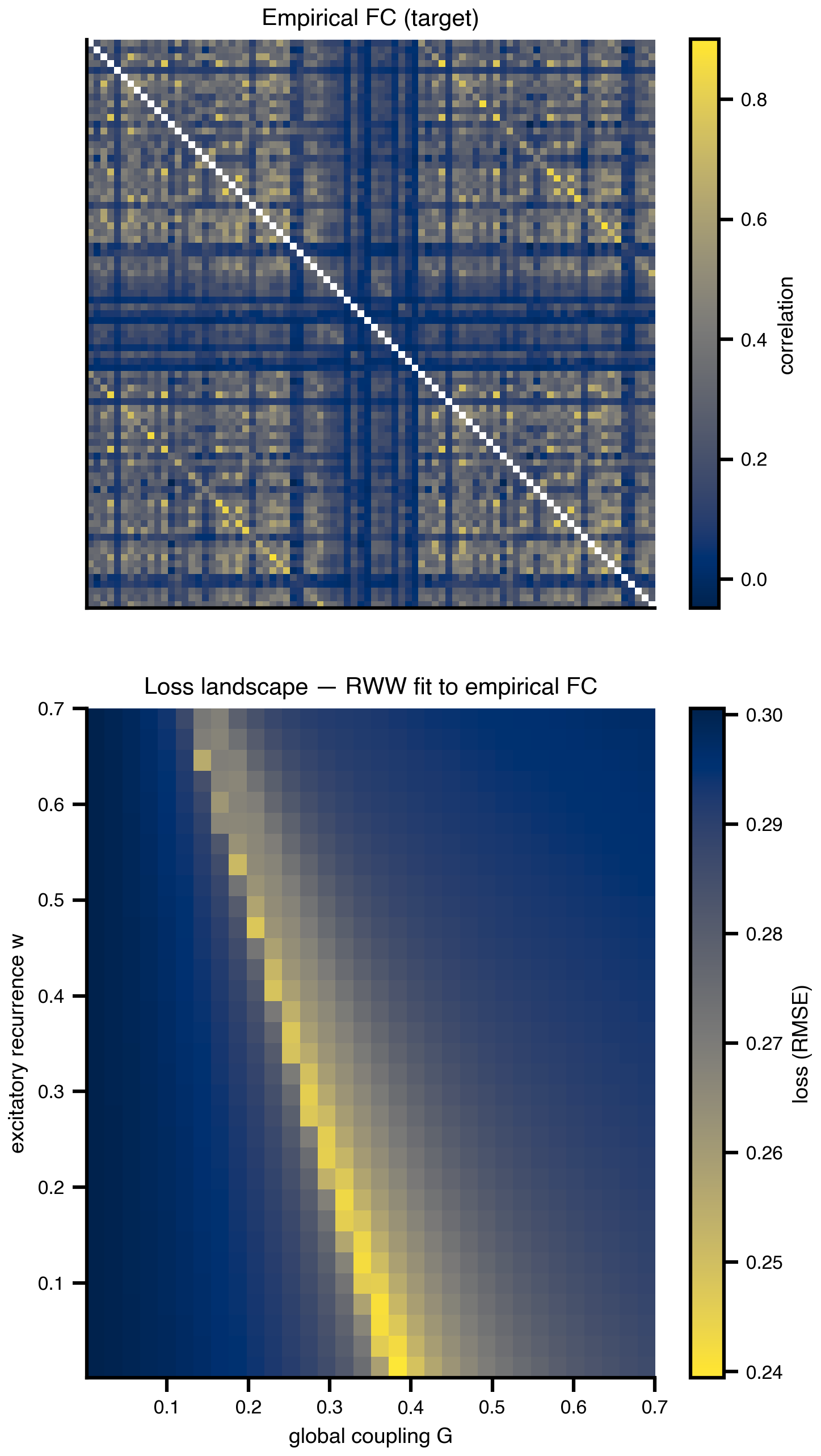
fig, ax = plt.subplots(figsize=(5.5, 4.5))
im = ax.imshow(
    loss_grid.values,
    cmap="cividis_r",
    extent=[G_axis.min(), G_axis.max(), w_axis.min(), w_axis.max()],
    origin="lower",
    aspect="auto",
    interpolation="none",
)
plt.colorbar(im, ax=ax, label=r"$\mathcal{L}(\theta)$")
ax.set_xlabel("global coupling G")
ax.set_ylabel("excitatory recurrence w")
ax.set_title("Loss landscape — RWW fit to empirical FC")

plt.tight_layout()
savefig("loss_surface_2d_only.png")
plt.show()
saved → ../img/section-4/loss_surface_2d_only.png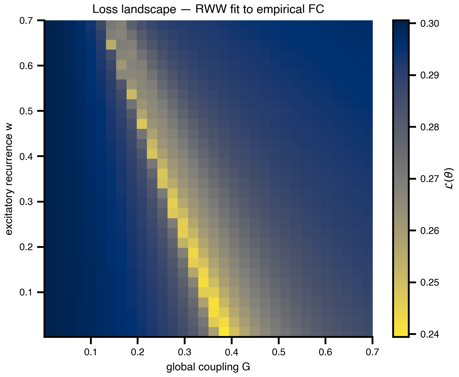
loss_surface_2d.png minus the FC panel, for slides that already showed the empirical FC.
4 Parallelism: how Space evaluates a grid
A short detour to make the API shape concrete. The grid scan above produced 1024 evaluations in one batched call distributed across 8 virtual JAX devices. This synthetic Gaussian loss (no dependency on the running example) illustrates the input/output relationship cleanly: parameters in, losses out, no per-evaluation Python loop. Same pattern powers random search, Sobol sampling, and the per-generation CMA-ES populations below.
n_par = 10
theta_axis = np.linspace(-1.0, 1.0, n_par)
T1, T2 = np.meshgrid(theta_axis, theta_axis)

# dummy Gaussian loss centered slightly off-origin
center = np.array([0.2, -0.3])
dummy_loss = 1.0 - np.exp(-((T1 - center[0]) ** 2 + (T2 - center[1]) ** 2) / 0.4)

from mpl_toolkits.axes_grid1 import make_axes_locatable

fig, (ax_in, ax_out) = plt.subplots(1, 2, figsize=(7.0, 4.6))

def style_axes(ax, title):
    ax.set_xlim(theta_axis.min() - 0.15, theta_axis.max() + 0.15)
    ax.set_ylim(theta_axis.min() - 0.15, theta_axis.max() + 0.15)
    ax.set_aspect("equal")
    ax.set_xlabel(r"$\theta_1$")
    ax.set_ylabel(r"$\theta_2$")
    ax.set_title(title)

marker_size = 200

ax_in.scatter(T1.ravel(), T2.ravel(), s=marker_size,
              color="lightgray", edgecolors="white", linewidths=0.8)
style_axes(ax_in, "Input: parameter grid")

sc = ax_out.scatter(T1.ravel(), T2.ravel(), c=dummy_loss.ravel(),
                    cmap="cividis_r", s=marker_size,
                    edgecolors="white", linewidths=0.8)
style_axes(ax_out, "Output: loss from one batched run")

# match the two panel widths by giving each axis its own colorbar slot
for ax, mappable in [(ax_in, None), (ax_out, sc)]:
    cax = make_axes_locatable(ax).append_axes("right", size="5%", pad=0.1)
    if mappable is None:
        cax.axis("off")
    else:
        fig.colorbar(mappable, cax=cax, label=r"$\mathcal{L}$")

plt.tight_layout()
savefig("parallelism_grid.png")
plt.show()
saved → ../img/section-4/parallelism_grid.png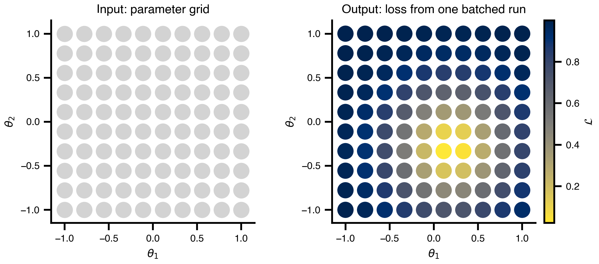
5 1D slice: the easy picture, with caveats
Take the same grid data and slice it along G at fixed w = 0.5. The 1D loss curve is what you’d plot if you only ever varied one knob — clean and easy to talk about, but it hides the degenerate valley that the 2D view exposes. Slicing also doesn’t generalize past 2-3 dimensions, which motivates the move to random sampling next.
w_slice = 0.5
i_w_slice = int(np.argmin(np.abs(w_axis - w_slice)))
loss_slice = loss_grid.values[i_w_slice, :]

fig, ax = plt.subplots(figsize=(6.5, 3.6))
ax.plot(G_axis, loss_slice, color="#0b3d91", linewidth=2)
ax.set_xlabel("global coupling G")
ax.set_ylabel("loss (RMSE)")
ax.set_title(f"Loss vs G  (slice at w = {w_axis[i_w_slice]:.3f})")
ax.grid(True, alpha=0.3)
savefig("loss_surface_1d.png")
plt.show()
saved → ../img/section-4/loss_surface_1d.png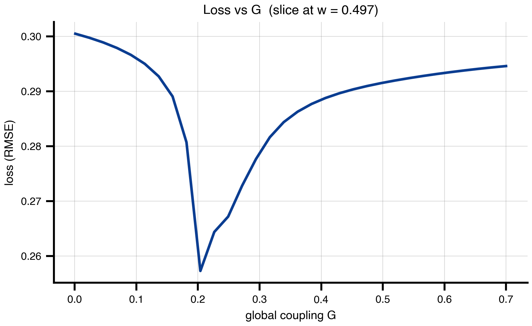
6 Random search: same range, 10× fewer evaluations
Same (G, w) ranges as the grid scan, 100 uniform samples instead of 1024 grid points. Bergstra & Bengio (2012) showed that real loss surfaces have low effective dimensionality, so random samples — which vary every axis at every trial — beat grid for the same budget once d > 2-3. The figure overlays the 100 samples on the (faded) grid landscape: same valley, far cheaper.
n_random = 100

random_state = copy.deepcopy(state)
random_state.dynamics.w = UniformAxis(0.001, 0.7, n_random)
random_state.coupling.instant.G = UniformAxis(0.001, 0.7, n_random)
random_space = Space(random_state, mode="zip", key=jax.random.key(42))

@cache("explore_random", redo=False)
def explore_random():
    exec = ParallelExecution(loss, random_space, n_pmap=8)
    return exec.run()

results_random = explore_random()
df_random = results_random.to_dataframe()
G_rand = df_random["coupling.instant.G"].values.astype(float)
w_rand = df_random["dynamics.w"].values.astype(float)
loss_rand = df_random["value"].values.astype(float)
fig, ax = plt.subplots(figsize=(6.5, 5.0))
im = ax.imshow(
loss_grid.values,
cmap="cividis_r",
extent=[G_axis.min(), G_axis.max(), w_axis.min(), w_axis.max()],
origin="lower",
aspect="auto",
interpolation="none",
alpha=0.5,
)
sc = ax.scatter(G_rand, w_rand, c=loss_rand, cmap="cividis_r",
s=70, edgecolors="black", linewidths=1.0, zorder=3)
plt.colorbar(sc, ax=ax, label=r"$\mathcal{L}(\theta)$")
ax.set_xlabel("global coupling G")
ax.set_ylabel("excitatory recurrence w")
ax.set_title(f"Random search — {n_random} samples")
savefig("random_search.png")
plt.show()saved → ../img/section-4/random_search.png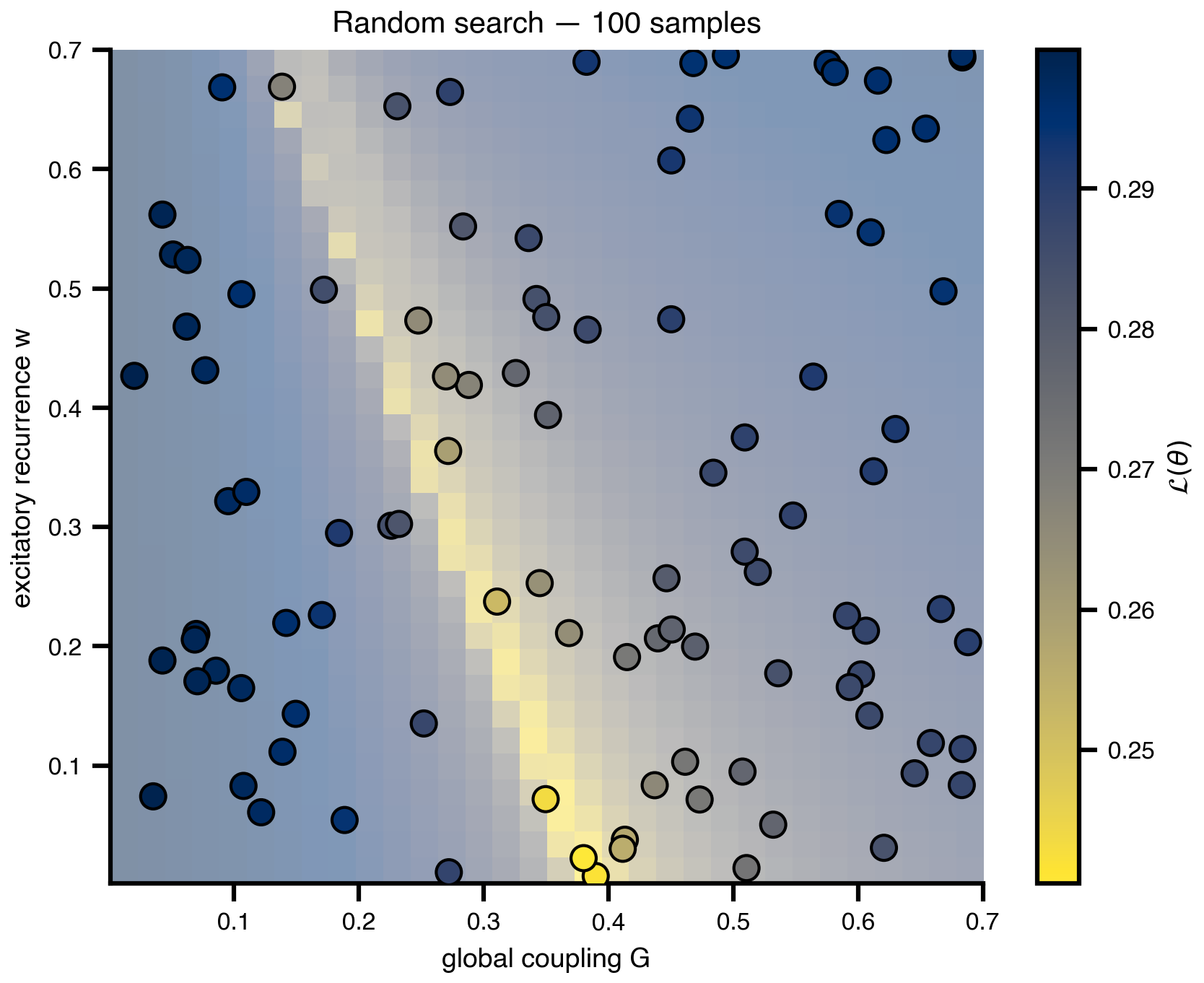
7 Sobol sensitivity: which knobs actually matter
A quantitative version of the Bergstra & Bengio claim. Quasi-random Sobol sequences combined with Saltelli’s design produce variance-based sensitivity indices: each parameter’s share of the loss variance, decomposed into direct effects (S1) and total effects including interactions (ST). Same Space + DataAxis plumbing as random search; the design matrix is just smarter. We extend the problem to three parameters (G, w, sigma) and confirm what the 2D landscape suggested: FC loss lives on an effectively 2D subspace, with sigma contributing essentially nothing.
from SALib.sample import sobol as sobol_sample
from SALib.analyze import sobol as sobol_analyze

problem = {
    "num_vars": 3,
    "names":  ["G", "w", "sigma"],
    "bounds": [[0.001, 0.7], [0.001, 0.7], [0.001, 0.01]],
}
N_saltelli = 256                          # → 256 * (2D + 2) = 2048 evals
samples = sobol_sample.sample(problem, N_saltelli)

salib_state = copy.deepcopy(state)
salib_state.coupling.instant.G = DataAxis(samples[:, 0])
salib_state.dynamics.w         = DataAxis(samples[:, 1])
salib_state.noise.sigma        = DataAxis(samples[:, 2])
salib_space = Space(salib_state, mode="zip")

@cache("explore_sobol_3p", redo=False)
def explore_sobol():
    exec = ParallelExecution(loss, salib_space, n_pmap=8)
    return exec.run()

results_sobol = explore_sobol()
losses_sobol = np.array(results_sobol.to_dataframe()["value"].values, dtype=float)
Si = sobol_analyze.analyze(problem, losses_sobol, print_to_console=False)
# Print Sobol indices for inspection / interpretation
import pandas as pd
names = problem["names"]
first_order = pd.DataFrame({
"S1": np.array(Si["S1"]),
"S1_conf": np.array(Si["S1_conf"]),
"ST": np.array(Si["ST"]),
"ST_conf": np.array(Si["ST_conf"]),
}, index=names).round(4)
S2 = np.array(Si["S2"]) # upper-triangular interaction matrix, NaNs on/below diag
S2_conf = np.array(Si["S2_conf"])
pairs = []
for i in range(len(names)):
for j in range(i + 1, len(names)):
pairs.append((f"{names[i]} × {names[j]}", S2[i, j], S2_conf[i, j]))
second_order = pd.DataFrame(pairs, columns=["pair", "S2", "S2_conf"]).round(4)
print("=== First / total order ===")
print(first_order)
print(f"\nΣ S1 = {first_order['S1'].sum():.3f} (≈1 → additive, ≪1 → interaction-dominated)")
print(f"Σ ST = {first_order['ST'].sum():.3f}")
print("\n=== Pairwise interactions (S2) ===")
print(second_order.to_string(index=False))=== First / total order ===
S1 S1_conf ST ST_conf
G 0.4740 0.1572 0.9290 0.1845
w 0.0271 0.1209 0.4925 0.1167
sigma -0.0012 0.0021 0.0007 0.0006
Σ S1 = 0.500 (≈1 → additive, ≪1 → interaction-dominated)
Σ ST = 1.422
=== Pairwise interactions (S2) ===
pair S2 S2_conf
G × w 0.4606 0.3059
G × sigma 0.0010 0.1914
w × sigma 0.0134 0.1510names = problem["names"]
S1, S1_conf = np.array(Si["S1"]), np.array(Si["S1_conf"])
ST, ST_conf = np.array(Si["ST"]), np.array(Si["ST_conf"])
order = np.argsort(ST) # ascending → biggest at top
y = np.arange(len(names))
fig, ax = plt.subplots(figsize=(6.5, 3.6))
ax.barh(y, ST[order], xerr=ST_conf[order], color="#0b3d91", alpha=0.85,
height=0.55, label="ST (total order)",
error_kw=dict(ecolor="black", lw=1, capsize=3))
ax.barh(y, S1[order], xerr=S1_conf[order], color="#f6b352",
height=0.30, label="S1 (first order)",
error_kw=dict(ecolor="black", lw=1, capsize=3))
ax.set_yticks(y, [names[i] for i in order])
ax.set_xlabel("Sobol index")
ax.set_title(f"Sensitivity of FC loss (Saltelli, N={N_saltelli}, {len(samples)} sims)")
ax.legend(loc="lower right", frameon=False)
ax.grid(True, axis="x", alpha=0.3)
savefig("sensitivity_sobol.png")
plt.show()saved → ../img/section-4/sensitivity_sobol.png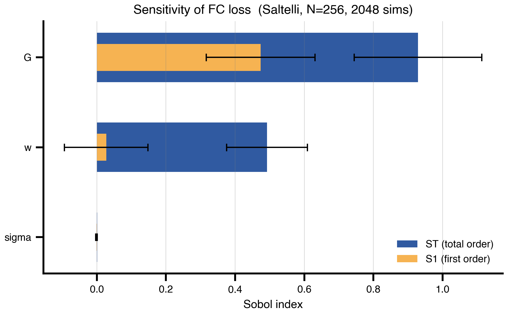
8 CMA-ES: adaptive sampling without gradients
Maintain a population, fit a Gaussian to its better half, bias the next generation toward low-loss regions. Each generation is one DataAxis batch — same parallel-evaluation pattern as the grid scan. No gradients required, which makes CMA-ES the right tool when the loss is non-smooth, chaotic, or you have ~10–50 parameters. The covariance ellipse rotates and shrinks to align with the curved valley over ~20 generations; the section saves both four-panel snapshots and an animation for the slide.
import cma

n_pop_cmaes = 16
max_gens = 20

@cache("cmaes_history", redo=False)
def run_cmaes():
    es = cma.CMAEvolutionStrategy(
        [0.05, 0.6], 0.15,
        {"bounds": [[0.001, 0.001], [0.7, 0.7]],
         "popsize": n_pop_cmaes,
         "maxiter": max_gens,
         "verbose": -9,
         "seed": 42},
    )
    history = []
    while not es.stop():
        pop = np.array(es.ask())          # (n_pop, 2)
        s = copy.deepcopy(state)
        s.coupling.instant.G = DataAxis(pop[:, 0])
        s.dynamics.w         = DataAxis(pop[:, 1])
        space = Space(s, mode="zip")
        results = ParallelExecution(loss, space, n_pmap=8).run()
        fits = np.array(results.to_dataframe()["value"].values, dtype=float)
        es.tell(pop.tolist(), fits.tolist())
        history.append({
            "pop":   pop,
            "fits":  fits,
            "mean":  np.array(es.mean),
            "C":     np.array(es.C),
            "sigma": float(es.sigma),
        })
    return history

cmaes_history = run_cmaes()
print(f"ran {len(cmaes_history)} generations × {n_pop_cmaes} candidates "
      f"= {len(cmaes_history) * n_pop_cmaes} evaluations")
# Helpers for plotting one CMA-ES generation
import matplotlib.animation as animation
from matplotlib.patches import Ellipse
def cov_ellipse(mean, C, sigma, ax, n_std=2.0, **kw):
"""Add a 2-σ ellipse for the CMA-ES sampling distribution."""
cov = (sigma ** 2) * C
eigvals, eigvecs = np.linalg.eigh(cov)
order = np.argsort(eigvals)[::-1]
eigvals, eigvecs = eigvals[order], eigvecs[:, order]
angle = np.degrees(np.arctan2(eigvecs[1, 0], eigvecs[0, 0]))
width, height = 2 * n_std * np.sqrt(eigvals)
e = Ellipse(xy=mean, width=width, height=height, angle=angle, **kw)
ax.add_patch(e)
return e
def draw_landscape(ax):
ax.imshow(
loss_grid.values,
cmap="cividis_r",
extent=[G_axis.min(), G_axis.max(), w_axis.min(), w_axis.max()],
origin="lower", aspect="auto", interpolation="none", alpha=0.55,
)
ax.set_xlim(G_axis.min(), G_axis.max())
ax.set_ylim(w_axis.min(), w_axis.max())
ax.set_xlabel("G")
ax.set_ylabel("w")
def draw_generation(ax, gen_idx):
h = cmaes_history[gen_idx]
pop, fits = h["pop"], h["fits"]
ax.scatter(pop[:, 0], pop[:, 1], c=fits, cmap="cividis_r",
s=50, edgecolors="black", linewidths=0.8, zorder=5)
ax.scatter([h["mean"][0]], [h["mean"][1]], color="red", marker="x",
s=80, linewidths=2.5, zorder=6)
cov_ellipse(h["mean"], h["C"], h["sigma"], ax,
edgecolor="red", facecolor="none", linewidth=1.5, zorder=6)
best = float(np.min([np.min(g["fits"]) for g in cmaes_history[:gen_idx + 1]]))
ax.set_title(f"gen {gen_idx + 1}/{len(cmaes_history)} best loss: {best:.4f}")snap_idx = [0,
len(cmaes_history) // 4,
len(cmaes_history) // 2,
len(cmaes_history) - 1]
fig, axes = plt.subplots(1, 4, figsize=(14, 3.6), sharey=True)
for ax, idx in zip(axes, snap_idx):
draw_landscape(ax)
draw_generation(ax, idx)
for ax in axes[1:]:
ax.set_ylabel("")
plt.tight_layout()
savefig("cma_es_snapshots.png")
plt.show()saved → ../img/section-4/cma_es_snapshots.png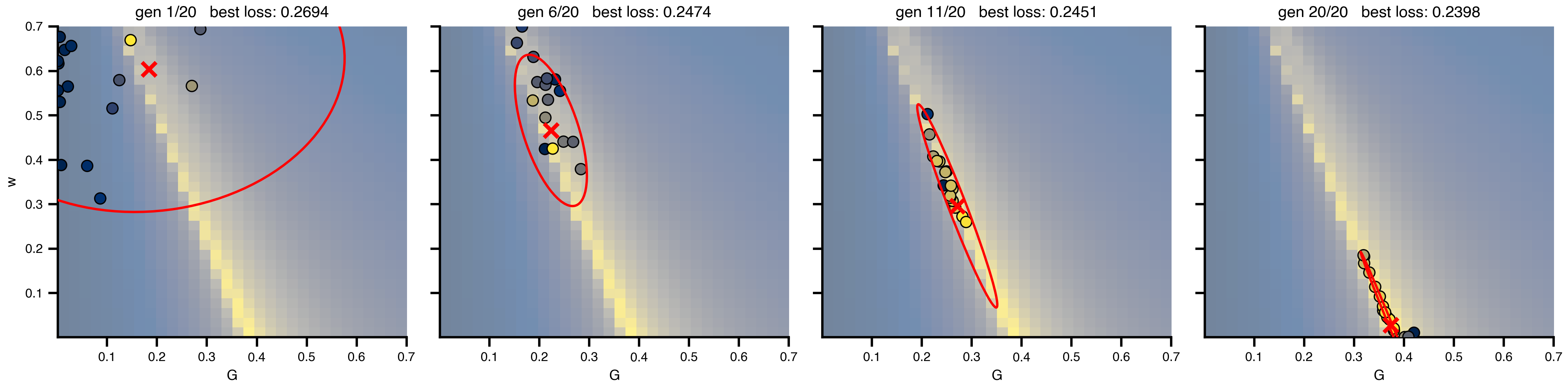
# Animated GIF of every generation
fig_anim, ax_anim = plt.subplots(figsize=(5.0, 5.0))

def init():
    ax_anim.clear()
    draw_landscape(ax_anim)
    return []

def update(frame_idx):
    ax_anim.clear()
    draw_landscape(ax_anim)
    draw_generation(ax_anim, frame_idx)
    return []

anim = animation.FuncAnimation(
    fig_anim, update, init_func=init,
    frames=len(cmaes_history), interval=700, blit=False,
)

gif_path = os.path.join(FIG_DIR, "cma_es_evolution.gif")
anim.save(gif_path, writer=animation.PillowWriter(fps=1.0), dpi=DPI)
print(f"saved → {gif_path}")
plt.close(fig_anim)
9 The sampling ceiling
Every method up to here evaluates the simulator at chosen theta and learns from the returned losses. None of them reach the regional-parameter regime where a single brain-network model has 10²–10⁴ knobs (one w_i per region, plus per-region noise, plus …). The bar chart shows roughly where each sampling method dies. The shaded band marks where regional brain models live; only gradient descent crosses it.
cividis = plt.get_cmap("cividis")
palette = [cividis(x) for x in (0.05, 0.35, 0.6, 0.9)]

methods = [
    ("Grid",             1, 3,      palette[0]),
    ("Random / Sobol",   1, 20,     palette[1]),
    ("CMA-ES",           1, 50,     palette[2]),
    ("Gradient descent", 1, 10_000, palette[3]),
]

fig, ax = plt.subplots(figsize=(8.5, 3.))

for i, (name, lo, hi, color) in enumerate(methods):
    ax.plot([lo, hi], [i, i], color=color, lw=12, solid_capstyle="butt",
            zorder=2)
    ax.annotate("", xy=(hi * 1.45, i), xytext=(hi, i),
                arrowprops=dict(arrowstyle="-|>,head_length=0.9,head_width=0.6",
                                color=color, lw=0, mutation_scale=22),
                annotation_clip=False, zorder=3)
    ax.text(hi * 1.9, i, f"$d \\approx {hi:,}$".replace(",", "{,}"),
            va="center", ha="left", fontsize=11, color=color)

# regional brain-model band
band_color = cividis(0.75)
ax.axvspan(1_00, 15_000, color=band_color, alpha=0.18, zorder=0)
ax.text(1_000, len(methods) - 1.65,
        "regional brain models\n($d \\sim 10^3$–$10^4$)",
        ha="center", va="center", fontsize=10, color="black",
        fontweight="bold", clip_on=False)

ax.set_xscale("log")
ax.set_xlim(1, 30_000)
ax.set_ylim(-0.7, len(methods) - 0.3)
ax.set_yticks(range(len(methods)))
ax.set_yticklabels([m[0] for m in methods])
ax.invert_yaxis()
ax.set_xlabel("parameter dimension $d$")
# ax.set_title("Sampling methods hit a wall — gradient descent doesn't",
            #  pad=18)

for spine in ("top", "right", "left"):
    ax.spines[spine].set_visible(False)
ax.tick_params(axis="y", length=0)
ax.grid(axis="x", which="both", ls=":", alpha=0.5)

plt.tight_layout()
savefig("method_ceiling.png")
plt.show()
saved → ../img/section-4/method_ceiling.png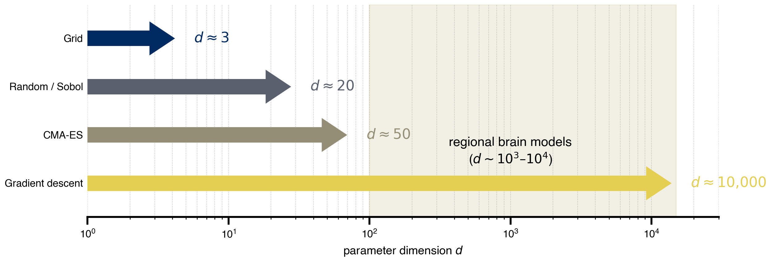
10 Gradient descent: the only thing that scales
Reverse-mode automatic differentiation gives gradients with respect to every parameter at the cost of ~3-30× one forward simulation, independent of dimension — this is what makes regional fits tractable. Here we still work in (G, w) for the figure, but the same code generalizes to n_nodes-dimensional parameter vectors without changing complexity. Adam is run from a deliberately off-valley starting point; the iterates trace into the low-loss valley. One trajectory, one optimum: gradient descent gives a good fit cheaply, not the valley itself. To characterize the valley you need a posterior, which is what the Bayesian sections do next.
opt_state = copy.deepcopy(state)
opt_state.dynamics.w = Parameter(jnp.array(0.2))            # start high in w
opt_state.coupling.instant.G = Parameter(jnp.array(0.1))   # start low in G

cb = MultiCallback([
    DefaultPrintCallback(every=20),
    SavingCallback(key="state", save_fun=lambda *args: args[1]),
])

@cache("optimize_trajectory", redo=False)
def optimize_trajectory():
    opt = OptaxOptimizer(loss, optax.adam(0.01), callback=cb)
    fitted, data = opt.run(opt_state, max_steps=200)
    return fitted, data

fitted_state, fitting_data = optimize_trajectory()

G_route = np.array([s.coupling.instant.G.value for s in fitting_data["state"].save])
w_route = np.array([s.dynamics.w.value         for s in fitting_data["state"].save])
import matplotlib.patheffects as path_effects
fig, ax = plt.subplots(figsize=(6.5, 5.0))
im = ax.imshow(
loss_grid.values,
cmap="cividis_r",
extent=[G_axis.min(), G_axis.max(), w_axis.min(), w_axis.max()],
origin="lower",
aspect="auto",
interpolation="none",
)
plt.colorbar(im, ax=ax, label="loss (RMSE)")
ax.plot(G_route, w_route, color="white", linewidth=1.5, alpha=0.9, zorder=4)
ax.scatter(G_route[::5], w_route[::5], color="white", s=18,
edgecolors="black", linewidths=0.6, zorder=5)
# start / end markers
for (G_pt, w_pt, label, dy) in [
(G_route[0], w_route[0], "start", +0.04),
(G_route[-1], w_route[-1], "optimized", -0.05),
]:
ax.scatter([G_pt], [w_pt], color="white", s=110,
edgecolors="black", linewidths=2, zorder=6)
ax.annotate(label, (G_pt, w_pt), xytext=(G_pt, w_pt + dy),
color="white", fontweight="bold", ha="center", zorder=7,
path_effects=[path_effects.withStroke(linewidth=2.5, foreground="black")])
ax.set_xlabel("global coupling G")
ax.set_ylabel("excitatory recurrence w")
ax.set_title("Gradient descent trajectory (Adam, 200 steps)")
savefig("gradient_trajectory.png")
plt.show()saved → ../img/section-4/gradient_trajectory.png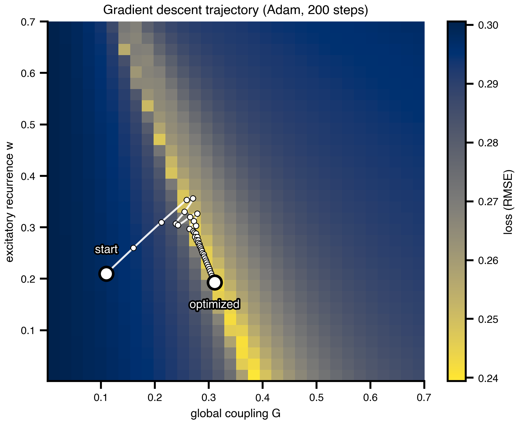
# Animated GIF of the gradient descent trajectory
fig_grad_anim, ax_grad_anim = plt.subplots(figsize=(5.5, 4.5))

n_steps_total = len(G_route)
anim_stride = max(1, n_steps_total // 60)
frame_indices = list(range(0, n_steps_total, anim_stride))
if frame_indices[-1] != n_steps_total - 1:
    frame_indices.append(n_steps_total - 1)

def draw_grad_landscape(ax):
    ax.clear()
    im = ax.imshow(
        loss_grid.values,
        cmap="cividis_r",
        extent=[G_axis.min(), G_axis.max(), w_axis.min(), w_axis.max()],
        origin="lower", aspect="auto", interpolation="none",
    )
    ax.set_xlim(G_axis.min(), G_axis.max())
    ax.set_ylim(w_axis.min(), w_axis.max())
    ax.set_xlabel("global coupling G")
    ax.set_ylabel("excitatory recurrence w")
    return im

_grad_im = draw_grad_landscape(ax_grad_anim)
fig_grad_anim.colorbar(_grad_im, ax=ax_grad_anim, label=r"$\mathcal{L}(\theta)$")

def grad_init():
    draw_grad_landscape(ax_grad_anim)
    return []

def grad_update(frame_idx):
    i = frame_indices[frame_idx]
    draw_grad_landscape(ax_grad_anim)
    ax_grad_anim.plot(G_route[: i + 1], w_route[: i + 1],
                      color="white", linewidth=1.5, alpha=0.9, zorder=4)
    ax_grad_anim.scatter([G_route[0]], [w_route[0]], color="white", s=110,
                         edgecolors="black", linewidths=2, zorder=6,
                         label=r"start $\theta$")
    ax_grad_anim.scatter([G_route[i]], [w_route[i]], color="white", marker="X",
                         s=110, edgecolors="black", linewidths=1.5, zorder=7,
                         label=r"optimized $\theta$")
    ax_grad_anim.legend(loc="upper right", framealpha=0.9)
    ax_grad_anim.set_title(f"Adam   step {i + 1}/{n_steps_total}")
    return []

grad_anim = animation.FuncAnimation(
    fig_grad_anim, grad_update, init_func=grad_init,
    frames=len(frame_indices), interval=120, blit=False,
)

grad_gif_path = os.path.join(FIG_DIR, "gradient_trajectory.gif")
grad_anim.save(grad_gif_path, writer=animation.PillowWriter(fps=4), dpi=DPI)
print(f"saved → {grad_gif_path}")
plt.close(fig_grad_anim)
11 Prior shapes: three regimes
Three small icons used as bullet decorations on the priors slide. Each is a square, axes-off sketch of one prior over the same range: uniform (just bounds), weakly informative Normal (broad shape, regularizes), strongly informative Normal (e.g. tied to a literature value, or a regional constraint from PET / EEG / receptor density). The point of the slide is that priors are a modular choice: same simulator, same data, different priors → different posteriors.
from scipy.stats import norm as _norm, uniform as _uniform

theta_p = np.linspace(0.0, 1.0, 400)
pico_color = plt.get_cmap("cividis")(0.55)

prior_shapes = {
    "prior_uniform.png": _uniform.pdf(theta_p, loc=0.1, scale=0.8),
    "prior_weak.png":    _norm.pdf(theta_p, loc=0.5, scale=0.18),
    "prior_strong.png":  _norm.pdf(theta_p, loc=0.65, scale=0.05),
}

for name, y in prior_shapes.items():
    fig, ax = plt.subplots(figsize=(1.2, 0.8))
    ax.fill_between(theta_p, y, color=pico_color, alpha=0.4)
    ax.plot(theta_p, y, color=pico_color, lw=2)
    ax.set_xlim(0, 1)
    ax.set_ylim(0, max(y.max() * 1.15, 1.5))
    ax.set_xticks([])
    ax.set_yticks([])
    for spine in ax.spines.values():
        spine.set_visible(False)
    fig.savefig(os.path.join(FIG_DIR, name), dpi=DPI,
                bbox_inches="tight", transparent=True)
    plt.close(fig)
print(f"saved → {list(prior_shapes)}")
saved → ['prior_uniform.png', 'prior_weak.png', 'prior_strong.png']12 Bayes in one picture
The textbook visual that introduces Bayes on the slide: a wide prior times a peaked likelihood gives a tighter posterior. Generic, no connection to the running example — its job is purely pedagogical, before we run actual inference on (G, w) next.
from scipy.stats import norm

theta = np.linspace(-4, 6, 400)

prior      = norm.pdf(theta, loc=1.0, scale=2.5)
likelihood = norm.pdf(theta, loc=2.2, scale=0.7)
unnorm     = prior * likelihood
posterior  = unnorm / np.trapezoid(unnorm, theta)

cividis = plt.get_cmap("cividis")
c_prior, c_like, c_post = cividis(0.15), cividis(0.55), cividis(0.9)

fig, ax = plt.subplots(figsize=(8.0, 3.8))

ax.fill_between(theta, prior,      color=c_prior, alpha=0.25)
# ax.fill_between(theta, likelihood, color=c_like,  alpha=0.25)
ax.fill_between(theta, posterior,  color=c_post,  alpha=0.35)

ax.plot(theta, prior,      color=c_prior, lw=2.5, label="prior  $p(\\theta)$")
# ax.plot(theta, likelihood, color=c_like,  lw=2.5, label="likelihood  $p(y \\mid \\theta)$")
ax.plot(theta, posterior,  color=c_post,  lw=3.0, label="posterior  $p(\\theta \\mid y)$")

ax.set_xlabel(r"$\theta$", fontsize=16)
ax.set_yticks([])
ax.set_xlim(theta.min(), theta.max())
for spine in ("top", "right", "left"):
    ax.spines[spine].set_visible(False)
ax.legend(frameon=False, loc="upper right")
# ax.set_title("Posterior = prior × likelihood (up to normalization)")

plt.tight_layout()
savefig("bayes_shrinkage.png")
plt.show()
saved → ../img/section-4/bayes_shrinkage.png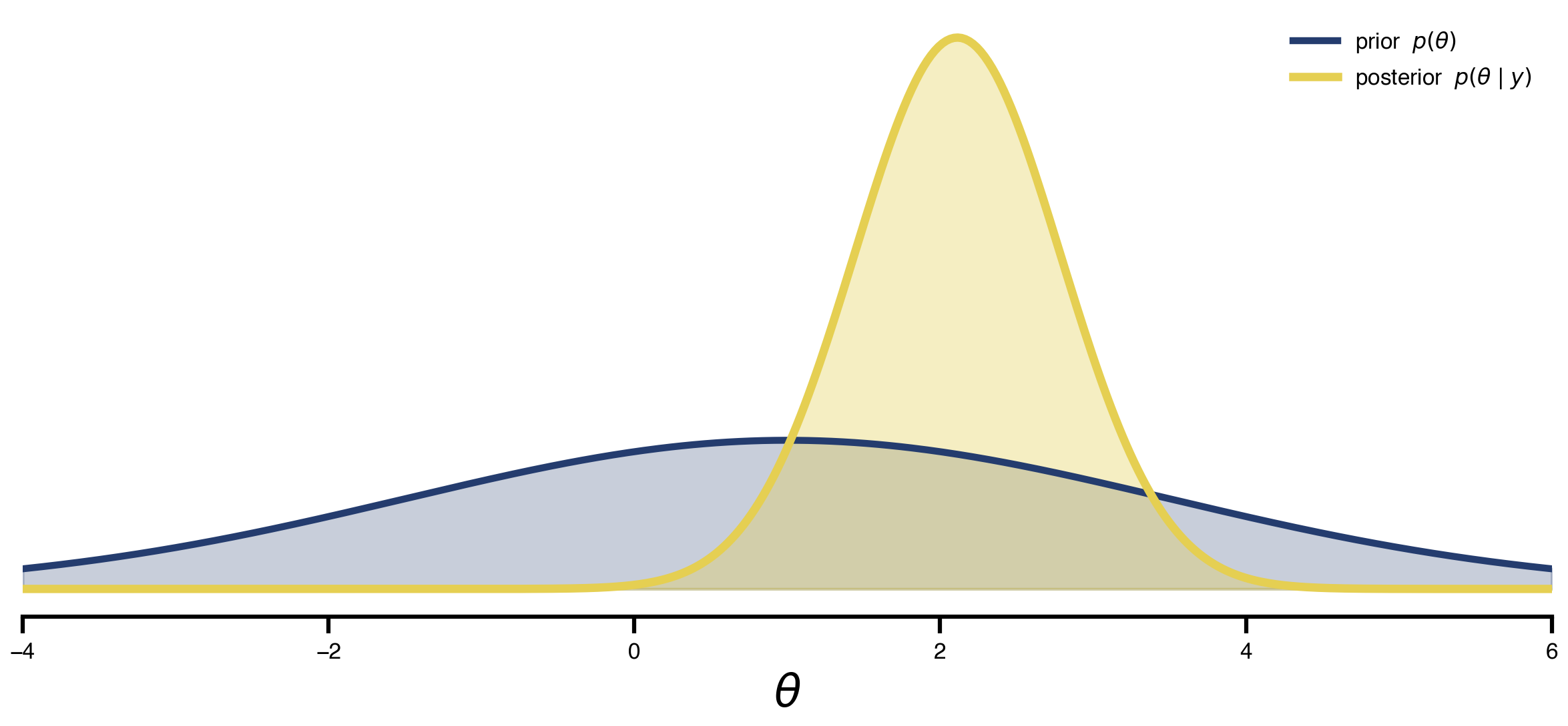
13 HMC vs SVI: posterior over the degenerate valley
Gradient descent gave one fit. This section gives all fits consistent with the data, on the same problem. Same fc_model, same wide priors (Uniform on both G and w), two inference algorithms back-to-back:
- NUTS (Hamiltonian Monte Carlo with adaptive step size). Asymptotically exact, gradient-based. ~4 h for 300 samples. Gold standard if you can afford it.
- SVI with an
AutoMultivariateNormalguide. Fits a Gaussian in unconstrained space by gradient descent on the ELBO. ~12 min, about 20× faster.
The expectation: HMC traces along the curved valley, recovering the diagonal (G, w) correlation that the grid scan made visible; SVI’s Gaussian family aligns with the valley locally but cannot bend, so the diagonal correlation collapses. The figure overlays both posteriors on the (faded) grid landscape with marginal histograms on the side.
import numpyro
from numpyro import distributions as dist
from numpyro.infer import MCMC, NUTS

fc_target_jax = jnp.asarray(fc_target)
triu_idx = jnp.triu_indices(fc_target_jax.shape[0], k=1)
fc_target_flat = fc_target_jax[triu_idx]

def fc_model(state_template, G_prior, w_prior, obs_sigma=0.05):
    """NumPyro model: priors on (G, w), Gaussian likelihood on FC upper-tri."""
    G = numpyro.sample("G", G_prior)
    w = numpyro.sample("w", w_prior)

    s = copy.deepcopy(state_template)
    s.coupling.instant.G = G
    s.dynamics.w         = w
    fc_sim = observation(s)

    numpyro.sample("obs",
                   dist.Normal(fc_sim[triu_idx], obs_sigma),
                   obs=fc_target_flat)

NUM_WARMUP = 200
NUM_SAMPLES = 300

def run_nuts(G_prior, w_prior, seed):
    kernel = NUTS(fc_model, target_accept_prob=0.7, max_tree_depth=7)
    mcmc = MCMC(kernel,
                num_warmup=NUM_WARMUP,
                num_samples=NUM_SAMPLES,
                num_chains=1,
                progress_bar=True)
    mcmc.run(jax.random.key(seed), state, G_prior, w_prior)
    return {k: np.asarray(v) for k, v in mcmc.get_samples().items()}

@cache("posterior_wide", redo=False)
def posterior_wide():
    return run_nuts(
        G_prior=dist.Uniform(0.001, 0.7),
        w_prior=dist.Uniform(0.001, 0.7),
        seed=0,
    )

from numpyro.infer import SVI, Trace_ELBO
from numpyro.infer.autoguide import AutoMultivariateNormal
import numpyro.optim as numpyro_optim

NUM_SVI_STEPS = 1500
NUM_SVI_SAMPLES = 2000

@cache("posterior_svi_wide", redo=False)
def posterior_svi_wide():
    """Same fc_model, same wide priors as posterior_wide — only the
    inference algorithm changes. AutoMultivariateNormal fits a Gaussian
    in unconstrained space; that family cannot bend along the curved
    (G, w) valley, so the posterior should look broader on the marginals
    but lose the diagonal correlation that HMC recovers."""
    guide = AutoMultivariateNormal(fc_model)
    svi = SVI(fc_model, guide,
              numpyro_optim.Adam(step_size=5e-3), Trace_ELBO())
    svi_result = svi.run(
        jax.random.key(0), NUM_SVI_STEPS, state,
        dist.Uniform(0.001, 0.7), dist.Uniform(0.001, 0.7),
    )
    posterior = guide.sample_posterior(
        jax.random.key(1), svi_result.params,
        sample_shape=(NUM_SVI_SAMPLES,),
    )
    return (
        {k: np.asarray(v) for k, v in posterior.items()},
        np.asarray(svi_result.losses),
    )

samples_wide = posterior_wide()
samples_svi, svi_losses = posterior_svi_wide()
print(f"HMC wide: G ∈ [{samples_wide['G'].min():.3f}, {samples_wide['G'].max():.3f}]   "
      f"w ∈ [{samples_wide['w'].min():.3f}, {samples_wide['w'].max():.3f}]")
print(f"SVI wide: G ∈ [{samples_svi['G'].min():.3f}, {samples_svi['G'].max():.3f}]   "
      f"w ∈ [{samples_svi['w'].min():.3f}, {samples_svi['w'].max():.3f}]")
print(f"SVI final ELBO loss: {svi_losses[-1]:.3f}  (start {svi_losses[0]:.3f})")
from scipy.stats import gaussian_kde
def plot_posterior_panel(fig, gs_outer, samples, title):
inner = gs_outer.subgridspec(2, 2, width_ratios=[4, 1.0],
height_ratios=[1.0, 4],
wspace=0.04, hspace=0.04)
ax = fig.add_subplot(inner[1, 0])
ax_top = fig.add_subplot(inner[0, 0], sharex=ax)
ax_rgt = fig.add_subplot(inner[1, 1], sharey=ax)
# loss heatmap as faded background
ax.imshow(
loss_grid.values,
cmap="cividis_r",
extent=[G_axis.min(), G_axis.max(), w_axis.min(), w_axis.max()],
origin="lower", aspect="auto", interpolation="none", alpha=0.75,
)
G_s = samples["G"]
w_s = samples["w"]
# joint KDE contours
kde = gaussian_kde(np.vstack([G_s, w_s]))
Gx, Wy = np.meshgrid(np.linspace(G_axis.min(), G_axis.max(), 120),
np.linspace(w_axis.min(), w_axis.max(), 120))
dens = kde(np.vstack([Gx.ravel(), Wy.ravel()])).reshape(Gx.shape)
ax.contour(Gx, Wy, dens, levels=6, colors="#d62728", linewidths=1.0)
ax.scatter(G_s, w_s, s=4, alpha=0.25, color="#d62728", zorder=3)
ax.set_xlim(G_axis.min(), G_axis.max())
ax.set_ylim(w_axis.min(), w_axis.max())
ax.set_xlabel("G", fontsize=15)
ax.set_ylabel("w", fontsize=15)
ax.tick_params(axis="both", labelsize=12)
# marginals
ax_top.hist(G_s, bins=40, color="#d62728", alpha=0.7,
range=(G_axis.min(), G_axis.max()))
ax_rgt.hist(w_s, bins=40, color="#d62728", alpha=0.7,
orientation="horizontal",
range=(w_axis.min(), w_axis.max()))
for a in (ax_top, ax_rgt):
a.set_xticks([]); a.set_yticks([])
for sp in a.spines.values():
sp.set_visible(False)
ax_top.set_title(title, fontsize=18)
fig = plt.figure(figsize=(13, 5.6))
outer = fig.add_gridspec(1, 2, wspace=0.18)
plot_posterior_panel(fig, outer[0, 0], samples_wide,
"HMC (NUTS) ~4 h")
plot_posterior_panel(fig, outer[0, 1], samples_svi,
"SVI (MV-Normal guide) ~12 min")
savefig("posteriors_compare.png")
plt.show()saved → ../img/section-4/posteriors_compare.png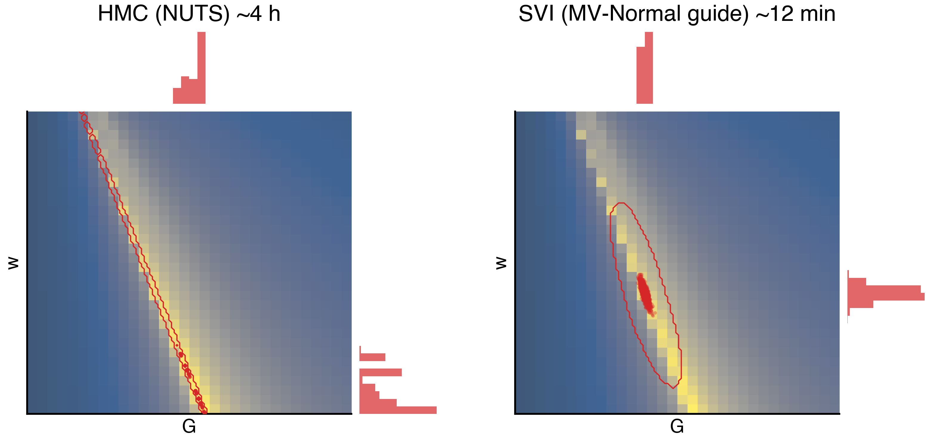
14 The recipe in one figure
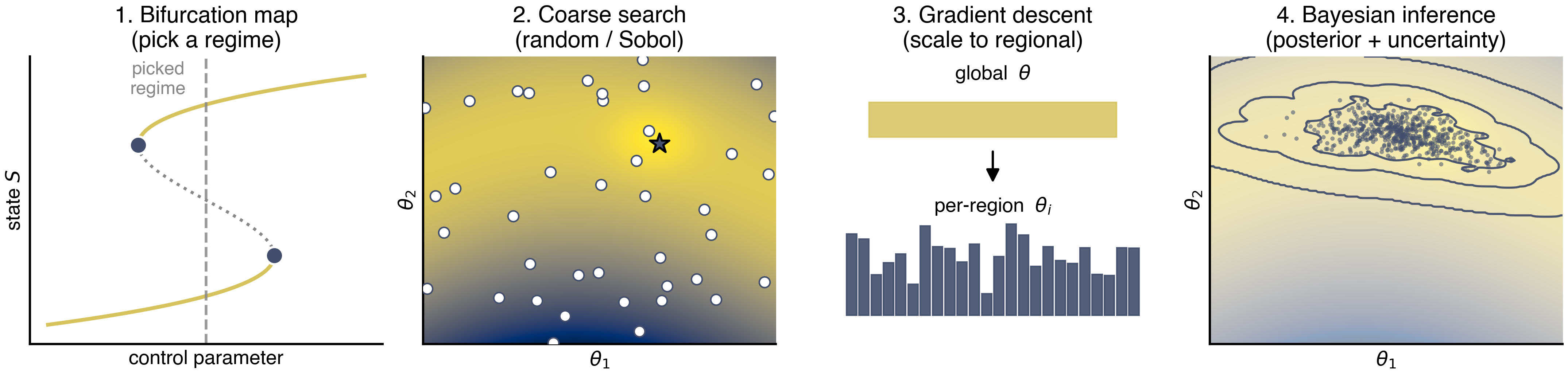
A four-panel cartoon for the closing slide. Each panel summarizes one stage of the default TVB-Optim workflow: (1) bifurcation map → pick a regime, (2) coarse random/Sobol search → find a basin, (3) gradient descent → polish global, then scale to regional, (4) Bayesian inference → posterior + uncertainty. Each step uses the previous as a warm start. All synthetic data, all cividis — the point is the workflow shape, not the numbers.
from matplotlib.patches import FancyArrowPatch

cmap = plt.get_cmap("cividis")
c_main, c_unstable, c_accent = cmap(0.85), "#888888", cmap(0.25)

PIPELINE_FS = {"title": 15, "label": 13, "annot": 12}
fig, axes = plt.subplots(1, 4, figsize=(14.5, 3.6))

# --- Panel 1: S-shaped saddle-node bifurcation diagram --------------------
ax = axes[0]
y_curve = np.linspace(-1.3, 1.3, 500)
x_curve = 0.55 * (y_curve ** 3 - y_curve)
y_fold_lo = -1.0 / np.sqrt(3)   # right fold (lower branch ends here)
y_fold_hi = +1.0 / np.sqrt(3)   # left fold (upper branch starts here)
m_lower = y_curve <= y_fold_lo
m_mid   = (y_curve > y_fold_lo) & (y_curve < y_fold_hi)
m_upper = y_curve >= y_fold_hi
ax.plot(x_curve[m_lower], y_curve[m_lower], color=c_main,     lw=2.5)
ax.plot(x_curve[m_mid],   y_curve[m_mid],   color=c_unstable, lw=2.0, ls=":")
ax.plot(x_curve[m_upper], y_curve[m_upper], color=c_main,     lw=2.5)
x_sn_right = 0.55 * (y_fold_lo ** 3 - y_fold_lo)
x_sn_left  = 0.55 * (y_fold_hi ** 3 - y_fold_hi)
ax.scatter([x_sn_right, x_sn_left], [y_fold_lo, y_fold_hi],
           s=130, color=c_accent, zorder=3, edgecolor="white", linewidth=1.5)
ax.axvline(0.0, color=c_unstable, lw=1.8, ls="--", alpha=0.85)
ax.text(-0.15, 1.45, "picked\nregime", ha="center", va="top",
        fontsize=PIPELINE_FS["annot"], color=c_unstable)
ax.set_xlim(-0.55, 0.55)
ax.set_ylim(-1.5, 1.5)
ax.set_xlabel(r"control parameter", fontsize=PIPELINE_FS["label"])
ax.set_ylabel(r"state $S$", fontsize=PIPELINE_FS["label"])
ax.set_xticks([]); ax.set_yticks([])
ax.set_title("1. Bifurcation map\n(pick a regime)", fontsize=PIPELINE_FS["title"])

# --- Panel 2: Ridged loss landscape with random samples -------------------
ax = axes[1]
gx, gy = np.meshgrid(np.linspace(0, 1, 300), np.linspace(0, 1, 300))
ridge = 0.5 + 0.25 * np.sin(2.5 * gx + 0.5)
# narrow ridge along the curve, with a localized minimum at (x_min, ridge(x_min))
x_min = 0.65
y_min = 0.5 + 0.25 * np.sin(2.5 * x_min + 0.5)
ridge_well = (gy - ridge) ** 2 * 8.0
basin      = -0.6 * np.exp(-(((gx - x_min) ** 2 + (gy - y_min) ** 2) / 0.015))
loss2 = ridge_well + 0.04 * (gx - 0.5) ** 2 + basin
ax.imshow(loss2, origin="lower", extent=[0, 1, 0, 1],
          cmap="cividis_r", aspect="auto")
rng = np.random.default_rng(7)
pts = rng.uniform(size=(40, 2))
ax.scatter(pts[:, 0], pts[:, 1], s=50, color="white",
           edgecolor=c_accent, linewidth=1.0, zorder=3)
# mark the "best" sample near the basin
ax.scatter([x_min + 0.02], [y_min - 0.015], s=180, marker="*",
           color=c_accent, edgecolor="black", linewidth=1.4, zorder=4)
ax.set_xlabel(r"$\theta_1$", fontsize=PIPELINE_FS["label"])
ax.set_ylabel(r"$\theta_2$", fontsize=PIPELINE_FS["label"])
ax.set_xticks([]); ax.set_yticks([])
ax.set_title("2. Coarse search\n(random / Sobol)", fontsize=PIPELINE_FS["title"])

# --- Panel 3: Global → regional --------------------------------------------
ax = axes[2]
ax.set_xlim(0, 1); ax.set_ylim(0, 1)
ax.axis("off")
# top: one fat bar labeled "w"
ax.add_patch(plt.Rectangle((0.15, 0.72), 0.7, 0.12,
                           color=c_main, alpha=0.85))
ax.text(0.5, 0.92, r"global  $\theta$", ha="center",
        fontsize=PIPELINE_FS["label"])
# arrow
arr = FancyArrowPatch((0.5, 0.68), (0.5, 0.55),
                      arrowstyle="-|>", mutation_scale=18,
                      color="black", lw=1.5)
ax.add_patch(arr)
# bottom: many short bars of varying height
n_reg = 24
xs = np.linspace(0.1, 0.9, n_reg)
heights = 0.05 + 0.30 * rng.beta(2, 2, n_reg)
for x, h in zip(xs, heights):
    ax.add_patch(plt.Rectangle((x - 0.014, 0.10), 0.028, h,
                               color=c_accent, alpha=0.9))
ax.text(0.5, 0.46, r"per-region  $\theta_i$", ha="center",
        fontsize=PIPELINE_FS["label"])
ax.set_title("3. Gradient descent\n(scale to regional)",
             fontsize=PIPELINE_FS["title"])

# --- Panel 4: Posterior (banana cloud + iso-density contours) -------------
from scipy.stats import gaussian_kde
ax = axes[3]
ax.imshow(loss2, origin="lower", extent=[0, 1, 0, 1],
          cmap="cividis_r", aspect="auto", alpha=0.45)
# samples along the ridge
t = rng.normal(loc=0.55, scale=0.12, size=600).clip(0.15, 0.95)
ridge_t = 0.5 + 0.25 * np.sin(2.5 * t + 0.5)
samples_y = ridge_t + rng.normal(scale=0.04, size=t.size)
ax.scatter(t, samples_y, s=8, color=c_accent, alpha=0.55, edgecolor="none")

# KDE iso-density contours
kde = gaussian_kde(np.vstack([t, samples_y]), bw_method=0.18)
gx_p, gy_p = np.meshgrid(np.linspace(0, 1, 200), np.linspace(0, 1, 200))
density = kde(np.vstack([gx_p.ravel(), gy_p.ravel()])).reshape(gx_p.shape)
levels = np.quantile(density, [0.55, 0.78, 0.92])
ax.contour(gx_p, gy_p, density, levels=levels, colors=c_accent,
           linewidths=1.4, alpha=0.95)

ax.set_xlabel(r"$\theta_1$", fontsize=PIPELINE_FS["label"])
ax.set_ylabel(r"$\theta_2$", fontsize=PIPELINE_FS["label"])
ax.set_xticks([]); ax.set_yticks([])
ax.set_xlim(0, 1); ax.set_ylim(0, 1)
ax.set_title("4. Bayesian inference\n(posterior + uncertainty)",
             fontsize=PIPELINE_FS["title"])

plt.tight_layout()
savefig("pipeline_overview.png")
plt.show()
saved → ../img/section-4/pipeline_overview.png